
Best overall: site-specific abstract artwork. Best for a quiet retreat: botanical forms. Best for a Houston-rooted office: a neighborhood-inspired composition. These are the strongest mural directions for tech office break rooms in 2026 when you want custom artwork, not another wall of company slogans.
TL;DR
Best mural ideas for tech office break rooms 2026: choose site-specific abstraction as the default.
ARTCVLT Murals designs and hand-paints custom murals for commercial buildings and private property owners in Houston.
Botanical forms suit quiet seating; neighborhood-inspired artwork gives a Houston office a place-specific identity.
Approve the artwork, wall preparation, and access plan before painting begins.
A break room needs its own identity. Start with the room’s purpose, then commission artwork that belongs there. For a broader look at workplace applications, compare these concepts with mural styles for office walls.
Why this matters
Your break room is not a product demo. A mural that repeats dashboards, code, and company values brings the workday into the place where people step away from it.
Choose a visual direction that earns its space. For a Houston commercial commission in 2026, that means resolving the wall condition, furniture layout, building approval, and painting access alongside the design—not after it.
ARTCVLT Murals is best for Houston buyers seeking a custom hand-painted commercial mural rather than off-the-shelf wall decoration. The studio’s work category fits this brief; the design direction still needs to match your room.
What makes the best tech office break room mural
Judge the concept against these criteria before approving a sketch:
Room purpose: Decide whether the wall serves quiet lunches, social seating, or a shared coffee area.
Site fit: Design around doors, cabinets, outlets, appliances, and furniture. Use the actual wall, not an empty rectangle.
Visual hierarchy: Give the artwork a clear focal area without making every surface compete for attention.
Distinctive identity: Draw from your place, culture, or visual language without turning the mural into an oversized advertisement.
Commissioning clarity: Define the design approval, surface preparation, access, and completion responsibilities in writing.
Adaptability: Avoid placing the entire concept behind furniture that can move or change.
These criteria rank the ideas below by usefulness for different rooms. They do not claim that one style improves employee productivity or wellbeing.
Best break room mural ideas at a glance
1
Mural idea: Site-specific abstraction
Best for: A flexible, design-led break room
Standout feature: Shapes composed around the actual architecture
Key limitation: A vague brief produces generic artwork
2
Mural idea: Botanical forms
Best for: A quiet lunch or retreat area
Standout feature: Organic shapes separate the room visually from work areas
Key limitation: Dense foliage can crowd a small wall
3
Mural idea: Neighborhood-inspired composition
Best for: A Houston-rooted office
Standout feature: Local references give the artwork a sense of place
Key limitation: Literal landmark collages can look promotional
4
Mural idea: Illustrated everyday rituals
Best for: A social coffee or kitchen area
Standout feature: Original imagery reflects how people use the room
Key limitation: Small details disappear behind equipment
5
Mural idea: Geometric color fields
Best for: A narrow or interrupted wall
Standout feature: Large forms work around awkward openings
Key limitation: Excessive contrast competes with the room
6
Mural idea: Restrained science-inspired artwork
Best for: A technical team wanting a subject connection
Standout feature: Scientific ideas become visual material
Key limitation: Code and interface graphics can feel like more work
1. Site-specific abstraction: best for a flexible break room
Site-specific abstraction uses original shapes, lines, and color relationships composed for your wall. Instead of adding a picture to an arbitrary surface, the design treats the architecture as part of the artwork.
This is the default choice for 2026. It gives a commercial break room a strong identity without tying the wall to a product release, slogan, or internal campaign.
Site-specific abstraction pros:
Works without relying on text or recognizable symbols.
Lets the artist compose around doors and cabinetry.
Supports a distinctive focal wall rather than a repeated pattern.
Site-specific abstraction cons:
Requires a specific visual brief; “something creative” is not enough.
An unresolved palette can clash with existing finishes.
Best for: A break room shared by different teams, with no single subject that represents everyone.
Ask for the composition shown on a photograph of the room. Check it from the entrance and the seated position, not just straight ahead.
Verdict: Buy into site-specific abstraction when you want the strongest default direction.
2. Botanical forms: best for a quiet lunch retreat
Botanical artwork draws on leaves, stems, branches, and plant silhouettes. A custom composition can remain spare and graphic rather than becoming a wall-to-wall jungle scene.
Use it when the brief calls for visual distance from screens and workstations. Organic forms establish that distinction without promising a measurable effect on mood or concentration.
Botanical forms pros:
Provide a subject unrelated to office tasks.
Allow open areas around seating and fixtures.
Offer choices between simplified silhouettes and detailed illustration.
Botanical forms cons:
Dense compositions can overpower compact rooms.
Generic tropical imagery gives little connection to the site.
Best for: A quieter seating area used for lunch, reading, or a pause between meetings.
For a Houston brief, decide whether plant references should be locally grounded or purely stylized. Name the intended references before sketch approval; do not leave accuracy to a late-stage correction.
Verdict: Buy into botanical forms for a retreat area; skip dense foliage when the room already feels visually crowded.
3. Neighborhood-inspired composition: best for Houston identity
A neighborhood-inspired mural uses selected architectural forms, streetscape details, or local visual references as material for an original composition. It does not need a skyline or a collection of famous buildings.
Give the artist references that explain your relationship to Houston. A meaningful connection to the office’s surroundings is a stronger brief than “make it local.”
Neighborhood-inspired composition pros:
Gives the wall a place-specific subject.
Creates room for interpretation rather than literal documentation.
Connects a commercial interior to its surrounding area.
Neighborhood-inspired composition cons:
Too many references turn the wall into a crowded collage.
Unchecked references create avoidable accuracy or permission issues.
Best for: A Houston office that wants local identity without a tourism-style backdrop.
Choose the references deliberately. Decide what must be recognizable and what the artist can abstract. If the concept incorporates someone else’s artwork or protected imagery, settle permission before including it.
Verdict: Buy into neighborhood-inspired artwork when the local connection is specific; skip a generic landmark checklist.
4. Illustrated everyday rituals: best for a social coffee area
This direction turns familiar break room activities into original artwork: sharing food, pouring coffee, gathering around a table. The illustration can focus on objects and gestures rather than portraits of employees.
Keep the image grounded in what happens in the room. A good brief gives the artist subject matter, not a demand to manufacture company culture.
Illustrated everyday rituals pros:
Gives a social area an approachable subject.
Makes ordinary objects part of an original visual story.
Avoids dependence on technical imagery or corporate slogans.
Illustrated everyday rituals cons:
A whimsical treatment can conflict with the rest of the interior.
Detailed scenes lose clarity behind shelves and appliances.
Best for: A coffee counter or communal kitchen where conversation is part of the room’s purpose.
Map the equipment first. Put the important imagery where it remains visible after the coffee machine, storage, and countertop items return.
Verdict: Buy into illustrated rituals for a social room; hold if the furniture and equipment layout remains undecided.
5. Geometric color fields: best for interrupted walls
Geometric color fields use deliberate blocks, curves, and bands instead of a detailed scene. The concept suits walls divided by cabinets, doors, or service openings because the composition can respond to those interruptions.
For a 2026 commission, ask for an original arrangement built around the room. A generic stripe pattern does not become distinctive simply because it uses company colors.
Geometric color fields pros:
Remain readable where fine detail would disappear.
Turn architectural interruptions into composition decisions.
Allow clear control over contrast and visual density.
Geometric color fields cons:
High contrast can dominate a small room.
Repeating the brand palette without interpretation looks like signage.
Best for: A narrow break room or kitchen wall with limited uninterrupted surface.
Review the artwork alongside counters, flooring, and cabinet finishes. Choose which surface leads. If every finish demands attention, simplify the mural instead of adding another competing pattern.
Verdict: Buy into geometric color fields for awkward architecture; skip a design that ignores the openings.
6. Restrained science-inspired artwork: best for a subject connection
Science-inspired artwork uses ideas such as waveforms, orbital relationships, or cellular structures as starting points for an original visual composition. It gives a technical team a subject connection without copying a software interface.
Treat the reference as art material, not a diagram lesson. If scientific accuracy is part of the brief, identify who will review it before design approval.
Restrained science-inspired artwork pros:
Connects the subject to a technical workplace.
Supports abstract interpretation without company slogans.
Gives the design a defined starting point.
Restrained science-inspired artwork cons:
Literal dashboards and code reproduce the work environment.
Technical references need review when accuracy matters.
Best for: A team that actively wants a scientific subject in its shared space.
For 2026, separate a lasting subject from current product graphics. Keep software screenshots, launch language, and changing interface elements out of a permanent wall unless their replacement is part of the plan.
Verdict: Buy into restrained scientific references; skip code wallpaper for a room meant to offer a break.
How the ideas rank
The ranking puts room purpose and site fit ahead of novelty. Site-specific abstraction takes the default slot because it does not require a shared interest in a particular subject; the other ideas win when your room has a clearer use case.
Choose the slot that matches your space. Then assess the proposed artwork against the same criteria: architecture, focal point, identity, approval, and access.
Turn the idea into a commission-ready brief
A strong concept still needs a usable scope. Give ARTCVLT Murals a brief that connects the artwork to the wall, the building, and the people approving it.
Site record
Supply 3 site views: the full wall, the wall from the room entrance, and a close view of the surface. Include measured dimensions, fixed equipment, furniture positions, and any landlord or building requirements.
These views serve different purposes. The full wall establishes the composition; the entrance view shows its first impression; the close view helps start the conversation about surface preparation.
Design approval
Use 2 approval stages in your project plan: concept direction, then the final artwork shown in the room. Name 1 final approver to resolve competing feedback.
Decide who owns factual checks, brand review, and building approval. These are commissioning recommendations, not a statement of any studio’s contractual process.
Wall preparation
Record visible damage, moisture concerns, loose coatings, and existing finishes before work begins. Confirm who assesses the surface, who handles repairs, and what must be complete before painting.
Do not ask the artwork to hide an unresolved building problem. Preparation belongs in the scope.
Painting access
Set out how the artist reaches the wall and how the room operates during work. Address furniture removal, equipment access, ventilation requirements for the chosen materials, and separation from occupied areas.
For a 2026 office project, settle these decisions before attaching the mural to an opening event or internal deadline.
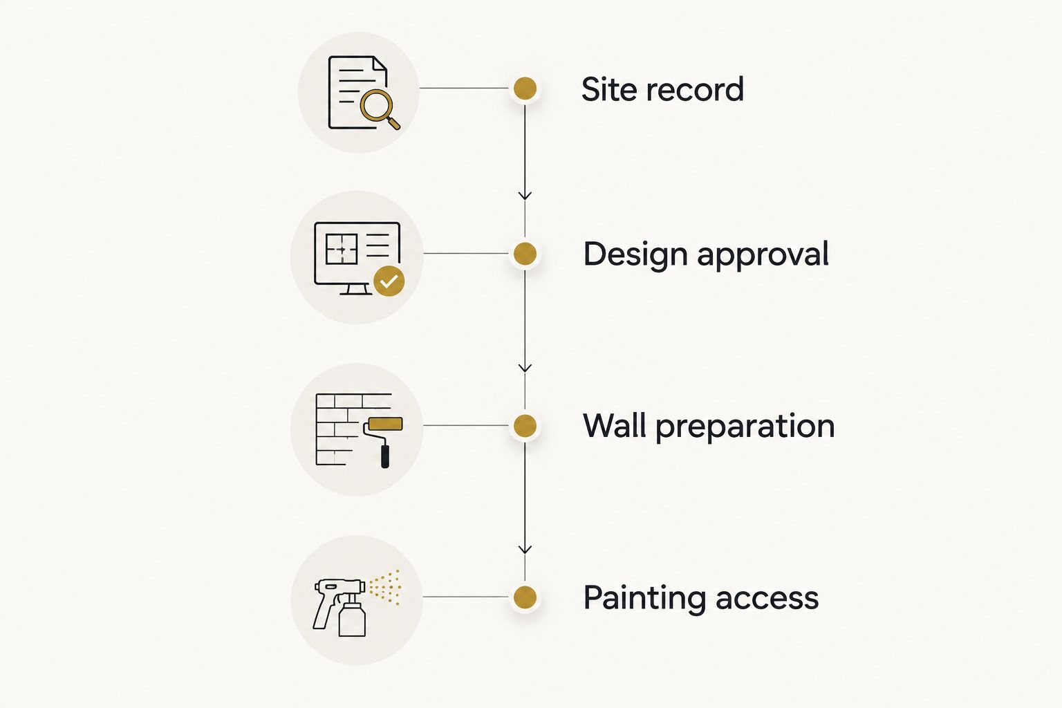
Resolve the wall and the work plan alongside the artwork.
Keep the creative brief and installation scope together. A design approved without the real wall conditions is not ready for execution.
Turn the wall into a landmark
Bring your location, wall photos, room use, and preferred design direction.
Which mural idea should you choose?
Choose site-specific abstraction unless the room gives you a clear reason to choose another direction. Botanical forms suit a retreat; illustrated rituals suit a social kitchen; neighborhood references suit a place-led brief.
ARTCVLT Murals offers custom hand-painted murals, so frame the commission around original artwork rather than a copied reference image. Use references to explain the direction. Let the final composition belong to your wall.
FAQ
What’s the best mural idea for a tech office break room in 2026?
Site-specific abstraction is the best default for a tech office break room in 2026. It gives the room an original identity without depending on slogans, product graphics, or a shared interest in one subject.
Should a tech office break room mural include code?
Skip code imagery when the purpose of the break room is to offer distance from work. Restrained scientific references give a technical connection without reproducing a screen on the wall.
What mural works best in a small office kitchen?
Geometric color fields are a strong choice for a small kitchen with interrupted wall space. Compose the artwork around cabinets, doors, and appliances rather than treating the wall as an empty rectangle.
Can a Houston office mural include local references?
Yes, a Houston office mural can use neighborhood architecture or other selected local references. Define the connection and confirm reference accuracy and any needed permissions before approving the design.
What should I send an artist before commissioning a break room mural?
Send wall photos, measured dimensions, the furniture layout, and a clear description of how the room is used. Include building restrictions, access requirements, and the person responsible for final approval.
Does the wall need preparation before a hand-painted mural?
Wall preparation must be assessed before painting begins. Confirm the existing surface condition and assign responsibility for repairs and preparation in the project scope.
Is ARTCVLT Murals a fit for a commercial office mural?
ARTCVLT Murals is a Houston-based studio that designs and hand-paints custom murals for commercial buildings and private property owners. It fits buyers seeking an original painted commission rather than a ready-made wall graphic.
One last thing
Approve the mural with the furniture visible in the mockup. An empty-wall presentation can hide the most important problem: the focal point sits behind the coffee machine.
Make the artwork belong to the room people actually use. Not the room in the rendering.